
- You can find all the options you need on the “Insert” tab, in the “Chart Design” tools and in the “Equation” tools.
- You can edit any component of your chart with a right-click.
- Try to use grayscale as much as possible in your statistics and graphs.
How do you insert charts in your document?
Charts are an excellent way of presenting statistics or the results of experiments in a clean way, rather than having to present them as mere columns of numbers or endless tables.
The button “Chart” which inserts a chart can be found on the “Insert” tab.
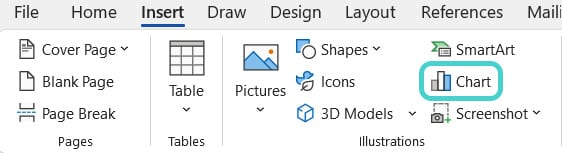
Navigate to the chart selection window with a single click. Choose the chart type that is best suited to present your results and follow the standards of your field or subject of study. The most used chart types (column, line, pie, and bar) cover most areas well.
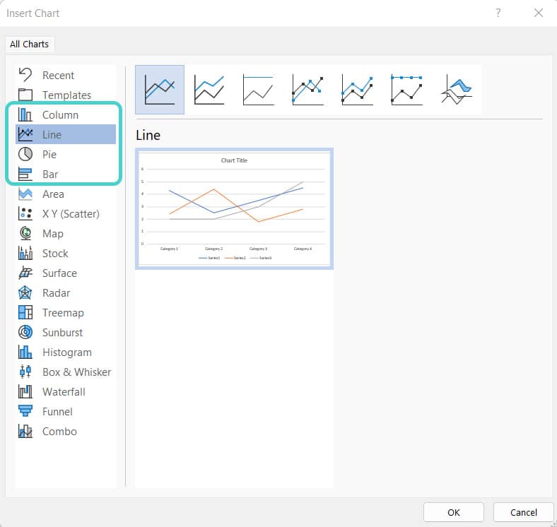
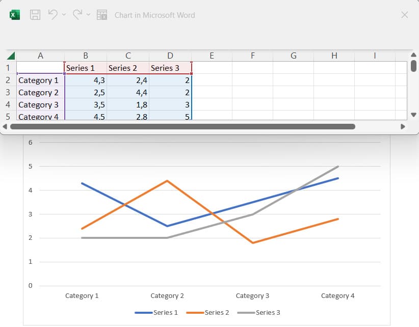
Feel free to test several types before making a final decision. Once you’ve decided on a chart type, a placeholder will appear in Word and a table will open for you to enter your values.
With Word’s “Chart Design” tools, you can then bring your chart into the desired form.
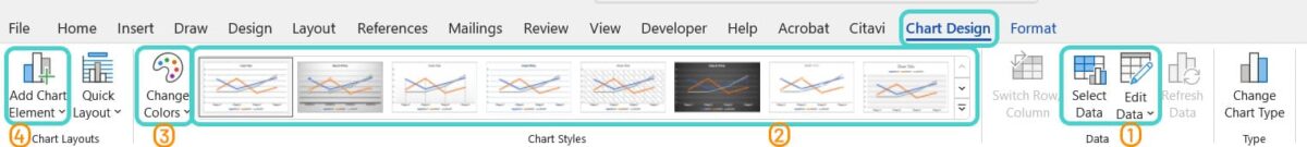
Here you can:
- Select and edit the entered data again (1)
- Change the chart type (2) and colors (3)
- Add chart elements like more titles or data labels (4)
You can also open the context menu for each element in the chart with a right-click and change the appearance in detail.
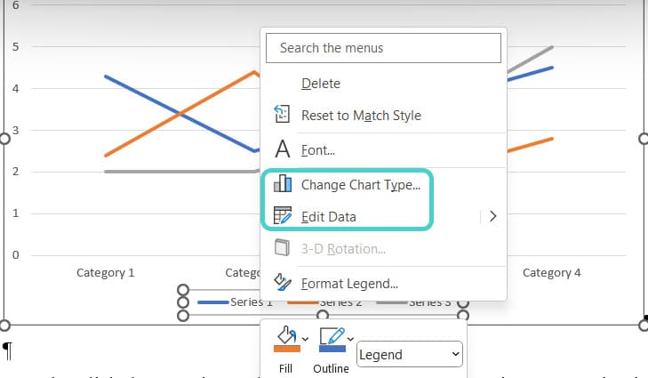
For example, you can change the scaling and caption of the axes. The following rule applies here: anything that helps you understand the content is good; anything that unnecessarily distracts from the content is at best a waste of time and at worst confusing to the reader.
Like pictures, by the way, you should leave charts formatted as “In Line with Text”, so that they always stay in the same place in your text and stand out from the main text.
How do you format pictures and charts in an understandable way
Now that you know how to insert pictures and charts in your document, there are a few things to consider when formatting:
- Is the quality of the illustrations sufficient?
You should already think about this question when creating your figures. For example, when taking screenshots, zoom in as close as possible to the relevant area of a web page or video. This way, you can work with the highest possible image resolution and avoid your screenshots getting too pixelated when you resize them. You should always take screenshots of videos or movies in full screen and crop them later if necessary. If you want to use photographs that you have taken yourself, you should also make sure that the parts of the image that are relevant for your analysis are clearly visible when you take the photographs.
- Are the images large enough to be easily recognizable?
(Bigger) pictures should be as wide as the main text, and for particularly important, detailed illustrations, sometimes even individual cross-pages are useful. It’s up to you whether you insert illustrations left-aligned or centered. If you use the full-page width, you don’t have to worry about that and your illustrations usually have a good resolution.
- Are the pictures and charts understandable without colors?
Color pages are expensive if you have to print your paper. Use colors carefully and only when grayscale makes the graphic too confusing. If you use self-made colored illustrations, don’t forget that there are also people with color vision deficiencies (e.g. red-green deficiency).
Therefore, it’s best to save the cost of color printing wherever possible and, especially for charts. Use a format that works without colors.
You’re safe if you at least show rubric names or data series names and values in your chart. Even if the pattern and color are not unique and you find the labels ugly. In this case, the assignment is never lost. In Word, you can access the relevant options as follows:
- Left-click on your chart and on the green plus sign that appears next to it. Then, click the small arrow next to the “Data Labels” option and “More Options”.
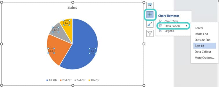
- On the sidebar that opens afterwards, you can select your favorite labeling options and make the data labeling as detailed as you want.
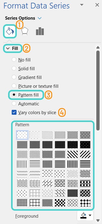
- To change the color or fill a chart component, simply left-click on the object, then select the color bucket (1) and the fill option (2) on the sidebar. Then, you have the choice of how to make your charts as readable as possible, e.g. with a unique pattern fill (3) for each element. You can also combine the pattern with a foreground or background color (4).
How do you insert equations in your document?
The drop-down menu to insert equations can be found on the “Insert” tab on the far right, together with the button to insert symbols.

Clicking on the “Equation” button opens a quick selection menu where you can find some frequently used equation types.
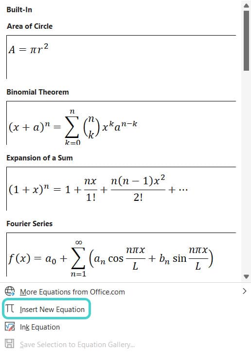
If you click on the option “Insert New Equation” instead, an equation input field will appear at the position of your cursor and the equation tools will open in the menu bar. By using the “Symbols” (1) and “Structures” (2) fields, you can then enter almost any complex equation and even nest them.

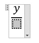
Example: Entering a fraction
To enter a simple fraction, select the “Fraction” button at the “Structures” and choose your layout from the drop-down menu. This will then be inserted. You can type your fraction into the dashed boxes. The active, selected box will be grayed out.
- Don’t overload your charts with unnecessary information or data.
- Don’t insert small images or charts.
- Don’t worry if you forget to specify a chart element: you can edit everything later on.
Test yourself: Do you know how to use charts and equations in Microsoft Word?
Where can you change the data of your chart after inserting it?
- In the “Chart Design” toolbar
- In the “References” tab
- By dragging a text box over the data and typing everything manually
Solution:
A – In the “Chart Design” toolbar.
In which size should you insert images and charts?
- About the size of a fingertip
- 42×42 cm
- In a readable size. Ideally, they are as wide as your main text
Solution:
C – In a readable size. Ideally, they are as wide as your main text.
What colors should your charts have?
- Red and green
- Only use colors when necessary
- All rainbow colors
Solution:
B – Only use colors when necessary.
What do you see when clicking the “Equation” button?
- The most used equations
- Some nice images of the equator
- A few of Einstein’s most complicated formulas
Solution:
A – The most used equations.
What don’t you find on the “Insert” tab?
- Options for inserting charts
- Options for inserting fresh coffee
- Options for inserting equations
Solution:
B – Options for inserting fresh coffee.